Navattic / SaaS ad concept breakdown
A product journey.
At the buyer’s pace.
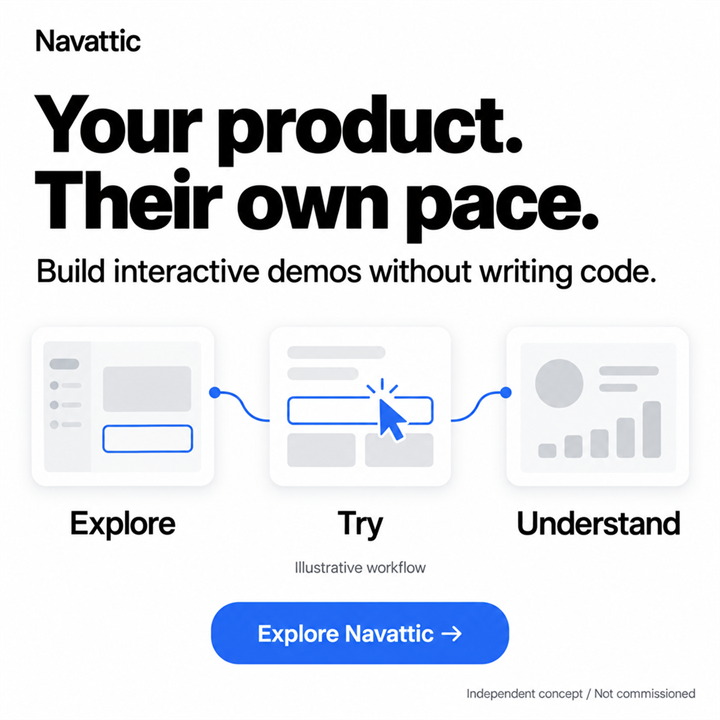
How can a static ad explain an interactive demo? This independent Navattic concept uses three connected moments—Explore, Try, Understand—to make self-guided product discovery visible.
Independent concept · Not commissioned. AI-assisted visuals. Illustrative workflows, not product screenshots. No campaign results.
- Intended audience
- SaaS product marketing and growth teams
- Message focus
- Self-guided interactive demos
- Work shown
- One square static ad concept
THE IDEA IN BRIEF
“Your product. Their own pace.” leads with the buyer’s experience. “Build interactive demos without writing code.” then connects that experience to the marketing team’s task. The illustration shows a journey, not a real product interface or a measured learning outcome.
01 / THE CREATIVE DECISION
The brief: connect two sides of the demo
The person buying demo software and the person exploring the finished demo have different jobs. A marketer needs to build the experience; a prospective customer needs to understand the product. This concept connects those two perspectives without giving them equal weight in the headline.
I chose the buyer’s pace as the opening idea. The supporting line supplies the practical context for the marketing team: creating an interactive demo without writing code. The ad stays focused on that relationship rather than trying to list every use case for demo software.
02 / THE CREATIVE DECISION
Why the headline starts with “your product”
“Your product. Their own pace.” addresses the marketer directly, then shifts attention to the prospective buyer. The short parallel phrases give the headline a clear contrast between ownership of the product and control of the experience.
On its own, the line could describe several types of content. The supporting sentence names interactive demos and no-code creation, making the category explicit. The headline introduces the experience; the second line explains what the advertiser offers.
The call to action, “Explore Navattic,” continues the discovery theme. In this portfolio image it is part of the artwork, not a working product-demo button.
03 / THE CREATIVE DECISION
Three screens, one continuous reading path
The illustration moves from Explore to Try to Understand. A blue line joins the three simplified screens, and a cursor highlights the middle interaction. That sequence is the visual argument: the buyer can engage with a product story rather than only read a description of it.
The white field and black headline keep the message prominent; blue connects the interaction, path and call to action. The published Navattic palette informed the visual direction. The screens were created for this concept and are labelled “Illustrative workflow.” They are not captures of Navattic or a customer’s application.
“Understand” describes the intended end of the story. The chart in the last screen is a schematic element, not evidence of increased revenue, product adoption or learning.
04 / BEFORE A LIVE CAMPAIGN
What I would validate before using this direction
A useful first check is whether viewers identify an interactive demo rather than a slideshow or generic onboarding flow. I would also ask which benefit they remember: independent exploration or no-code creation. That would reveal whether the two message levels support each other or compete.
For a real campaign, the next step should match the promise. A destination demonstrating self-guided exploration would let visitors experience the idea. The advertiser would still need to confirm the product claims, intended audience and available destination.
A future creative experiment could isolate the headline while retaining the diagram and offer. This concept has not been run as an ad, so there is no conversion or engagement result to report.
A principle to take into the next brief
When a SaaS product helps one team create an experience for someone else, give each audience a clear role in the copy. Here, the headline centres the buyer and the supporting line explains the marketer’s task.
Concept development, in-image copy, visual direction and AI-assisted image generation by Dana Fink. The brand is not presented as a client. View this work in the portfolio.