Dana FinkSaaS ad creative
Let’s talk

DANA FINK / SAAS AD CREATIVE

Making ideas
visible.

Turning SaaS product features into clear advertising stories. From the message and copy to the visual idea.

Explore the work

Message → copy → visual

01 / PORTFOLIO

Behance

A feed of ideas.

The ideas, the thinking, and the stories behind them.

Independent concepts, not commissioned by the brands. AI-assisted visuals; illustrative workflows and data. These creatives have not been run as advertising campaigns.

df.
monday service / 01
IDEA 01
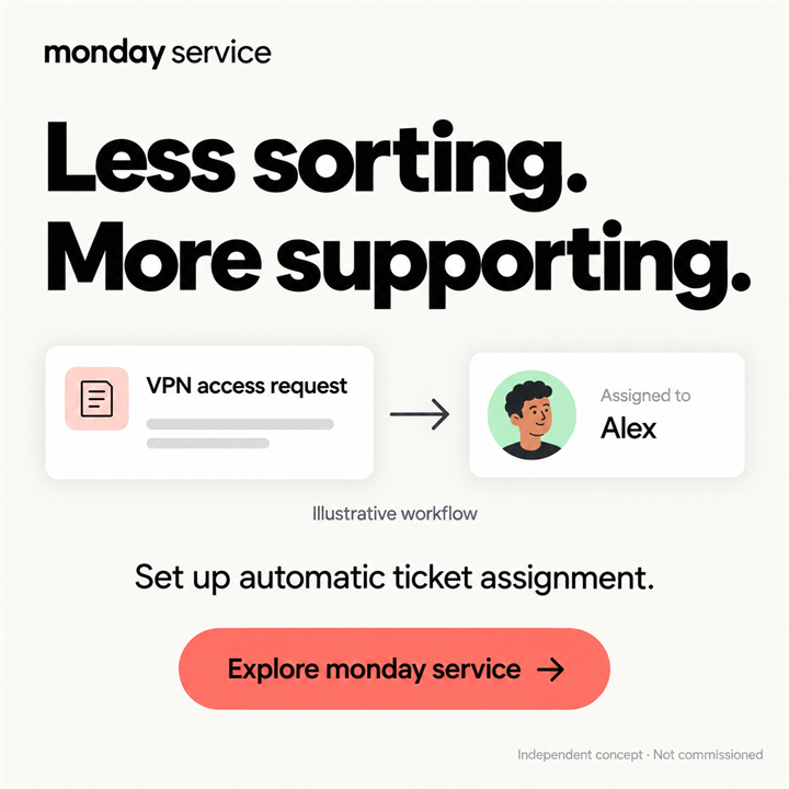
monday service — Less sorting. More supporting.
Behance ↗

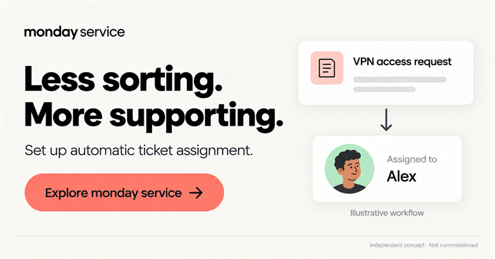
Less sorting. More supporting.

A self-initiated concept for IT support teams. The starting point is a specific routine: deciding who should own an incoming ticket, rather than promising to resolve every issue.

Show moreShow less

The thinking

Automatic assignment has a clear visual sequence: incoming request → assigned teammate. “Less sorting. More supporting.” connects that mechanism to the team’s work without inventing resolution times or numerical savings.

The creative decision

One ticket and one teammate make the mechanism tangible. The light background gives the headline space, and the coral button completes the reading path. Alex and the VPN request are illustrative examples. Assigned does not mean resolved.
df.
monday service / 02
IDEA 02
monday service — Still assigning tickets by hand?
Behance ↗

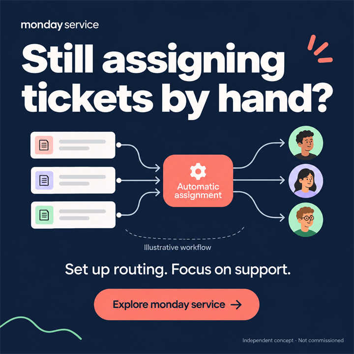
Still assigning tickets by hand?

A second independent concept about ticket assignment. For the same audience, it opens with a question about a familiar manual task: “Still assigning tickets by hand?”

Show moreShow less

The thinking

Rather than listing product features, the idea explains the assignment mechanism. During revision, the centre of the diagram changed: automatic assignment replaced an overloaded person as the focal point.

The creative decision

Requests and teammates are connected to show what happens after a ticket arrives. This is an alternative message and composition, not an A/B-test winner. No campaign comparison took place, and several elements differ between the versions.

df.
monday service / 03
IDEA 03
monday service — Same idea. A wider frame.
Behance ↗

Same idea. A wider frame.

The landscape version continues the same IT support story. Its brief is to carry the message into a wider frame while keeping the copy and workflow connected.

Show moreShow less

The thinking

A wide layout creates a different reading path: headline, process and action need to follow each other clearly. The adaptation is treated as its own composition rather than a cropped square.

The creative decision

It preserves the assignment message and the series’ visual direction. Small labels become less legible when reduced, so the light square remains the preferred first presentation. The landscape version can be opened at a larger size for a closer look.

df.
Baremetrics / 04
IDEA 04
Baremetrics — Make sense of subscription revenue
Behance ↗

Make sense of subscription revenue

A concept for subscription SaaS founders and finance teams. It starts with a question about MRR: seeing a revenue change is different from understanding what sits behind it.

Show moreShow less

The thinking

Subscription revenue movements provide the product foundation. A ChartMogul reference informed the principle of explaining a management question with one infographic; its forecasts and numerical claims were not carried over.

The creative decision

One illustrative line, labelled New subscriptions, Upgrades and Cancellations, explains the headline. A light canvas and pastel chart reflect Baremetrics’ visual character. This is not a real interface, measured revenue or evidence of growth.

df.
UserEvidence / 05
IDEA 05
UserEvidence — Turn feedback into customer proof
Behance ↗

Turn feedback into customer proof

A concept for B2B marketing and sales enablement. The brief is to show customer feedback becoming material a sales team can use in a conversation.

Show moreShow less

The thinking

The message is built around the contrast between proof and promise. A G2 reference informed the combination of bold copy and customer voice, without bringing over a portrait, testimonial or claimed outcome.

The creative decision

The feedback → evidence diagram makes transformation the central event. Quotation marks stand for a type of material, not an invented customer quote. A bold black headline and purple accents connect the idea to UserEvidence’s visual character.

df.
WhatConverts / 06
IDEA 06
WhatConverts — Connect the source to the lead
Behance ↗

Connect the source to the lead

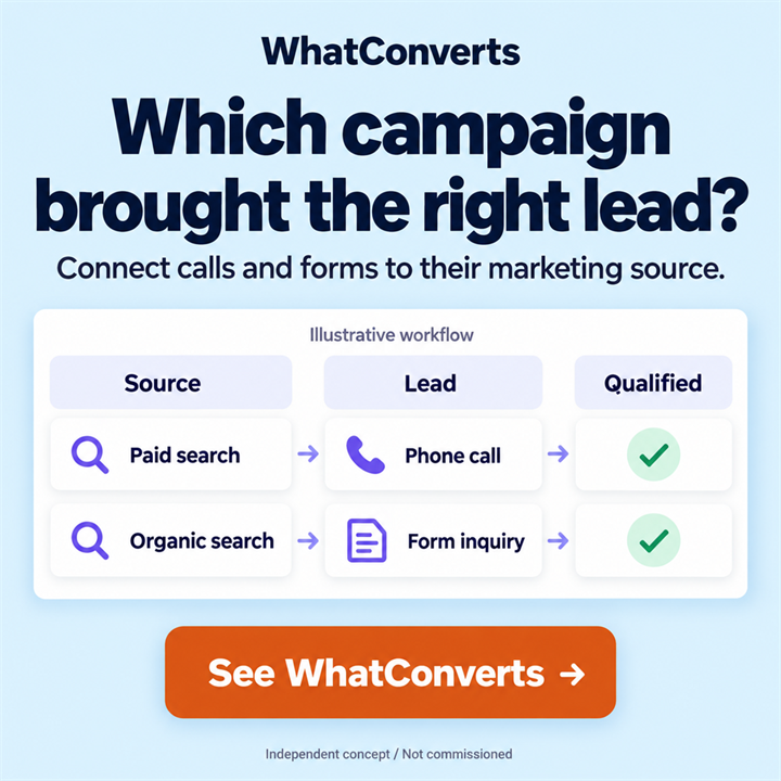
A concept for agencies and performance teams. Instead of an abstract lead count, it asks a practical question: which campaign brought a relevant inquiry?

Show moreShow less

The thinking

The connection between source, call or form, and qualification comes from the product research. A CallRail reference informed the link between marketing and a valuable inquiry; a reporting structure replaces the phone-and-coins metaphor.

The creative decision

Two illustrative rows make Source → Lead → Qualified easy to follow. A blue field and white cards keep attention on the information. The checkmarks are examples, not a claim that every lead qualifies or that qualification is always automatic.

df.
Storylane / 07
IDEA 07
Storylane — Let the product be explored
Behance ↗

Let the product be explored

A concept for product marketing and demand generation teams. The starting point is moving from a description of a product to the idea of exploring it through an interactive demo.

Show moreShow less

The thinking

The focus is Demo Suite and buyer-led exploration. A Demostack reference informed the use of one buyer-facing message and large typography, not a copied interface.

The creative decision

A cursor and a highlighted action make participation the central image. The dark burgundy setting and light window follow Storylane’s visual direction at the time of research. The window is an illustration, not a product screenshot or a working demo.

df.
Navattic / 08
IDEA 08
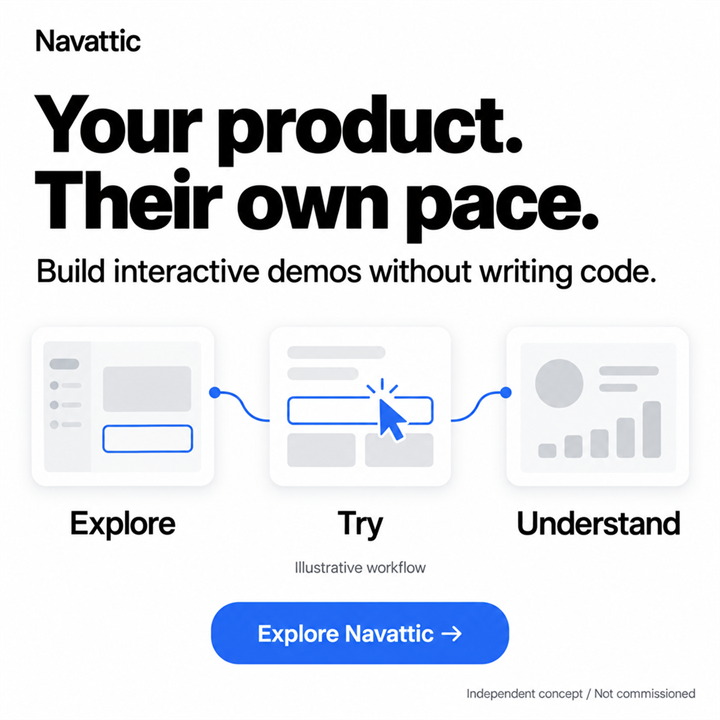
Navattic — At the buyer’s own pace
Behance ↗

At the buyer’s own pace

A concept for SaaS marketing and growth teams. It centres on a buyer discovering a product independently, at their own pace.

Show moreShow less

The thinking

The research connected two layers of the message: self-guided exploration for the buyer and no-code demo creation for the team. Unlike Storylane’s single interaction, this concept tells its story through a sequence.

The creative decision

Explore → Try → Understand are connected by a blue line. White, black and blue follow Navattic’s published palette as a visual guide. The illustrative screens show a discovery journey, not real interface captures or a measured learning outcome.

df.
Missive / 09
IDEA 09
Missive — One email. A clear owner.
Behance ↗

One email. A clear owner.

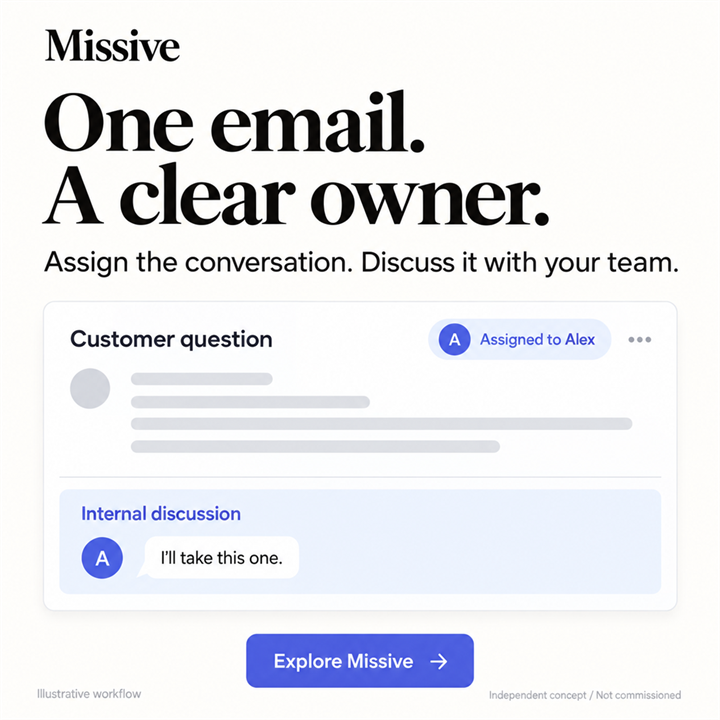
A concept for teams working from a shared inbox. The brief is to show one email gaining a clear owner and an internal discussion.

Show moreShow less

The thinking

Instead of a broad productivity promise, it focuses on two visible actions: assign the conversation and discuss it with the team. A Front reference informed the focus on a coordination problem; the new execution takes a calmer tone.

The creative decision

One inquiry, an assignment to Alex and “I’ll take this one” tell a small work story. The light canvas, blue accent and headline character follow observations of Missive. The teammate and conversation are fictional examples, not a customer testimonial.

df.
TextExpander / 10
IDEA 10
TextExpander — A shortcut. A saved reply.
Behance ↗

A shortcut. A saved reply.

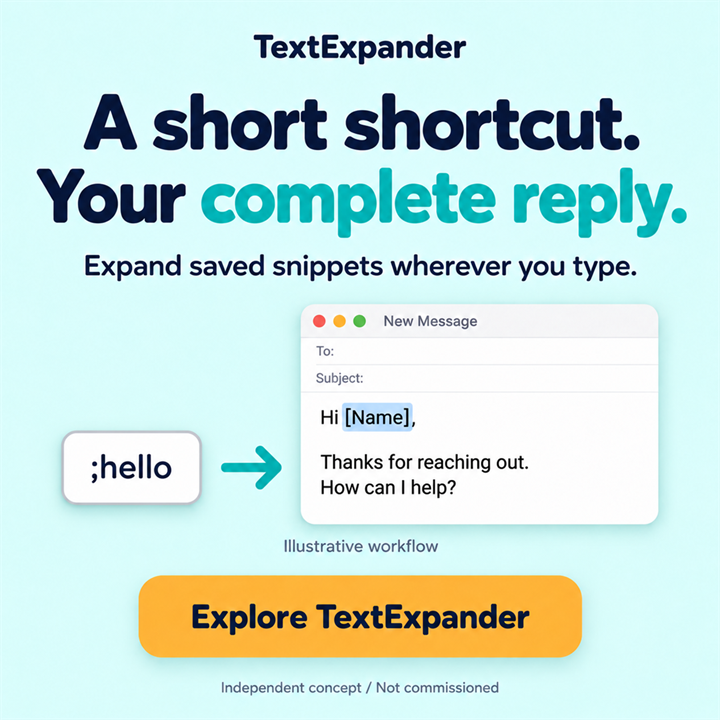
A concept for support and operations teams using repeated replies. The brief was to explain how a short abbreviation expands into saved text.

Show moreShow less

The thinking

An email context makes the result concrete. A Grammarly reference informed the presentation of text inside a work setting, but its AI rewriting mechanism is not attributed to TextExpander: this is snippet expansion.

The creative decision

The ;hello block, arrow and complete reply form a clear cause-and-effect sequence. In the selected v03 revision, the abbreviation and arrow were moved closer to the reply. The example email is illustrative; the creative does not promise new text generation or automatic sending.

df.
Inventive AI / 11
IDEA 11
Inventive AI — From knowledge to a draft
Behance ↗

From knowledge to a draft

A concept for proposal teams and sales engineering. It starts with company knowledge that already exists before work on the next RFP begins.

Show moreShow less

The thinking

Rather than promising an instant tender win, it explains a process: company resources become the foundation for a draft. Responsive and Loopio references helped focus the hierarchy and give the work a concrete object: a response.

The creative decision

Document categories converge into an RFP draft, while “Ready for your review” preserves a human review step. A light canvas and soft peach accents reflect the brand’s character. Categories and status are illustrative; no speed, accuracy or win-rate figures are used.

df.
Conveyor / 12
IDEA 12
Conveyor — An answer connected to its source
Behance ↗

An answer connected to its source

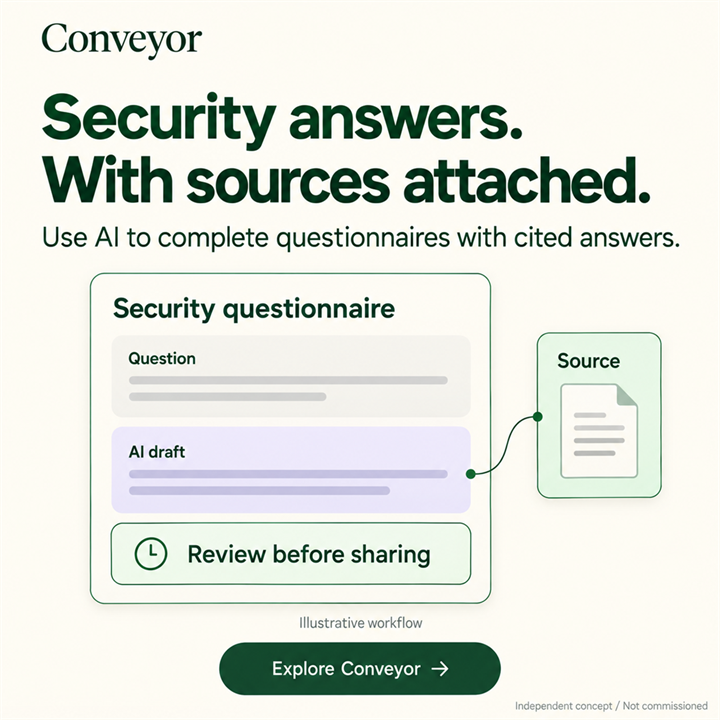
A concept for security/GRC and sales engineering. In a security questionnaire, the answer matters alongside the source someone can consult when reviewing it.

Show moreShow less

The thinking

The research put the connection between an AI draft and a cited source at the centre. A Vanta reference informed the use of a small, understandable workflow fragment; the new concept replaces its progress bar with an answer, source and review.

The creative decision

Question → AI draft → Source explains the idea without a crowded dashboard. “Review before sharing” preserves the review step. Calm greens reflect Conveyor’s character. The creative does not promise error-free automation; attached means connected to a source, not an email attachment.

df.
UserGems / 13
IDEA 13
UserGems — A reason to reconnect
Behance ↗

A reason to reconnect

A concept for outbound sales and RevOps. The story starts with someone already familiar with the company: a past buyer or user has moved to a new employer.

Show moreShow less

The thinking

One signal was chosen from a wider set: a job change. This focus gives a reason to reconnect without promising a ready-made deal. A 6sense reference informed the short headline and single signal instead of a complex dashboard.

The creative decision

The transition from Past champion to New company becomes the main event, while the dark palette reflects UserGems’ technology-led character. No real personal data is used. A job change does not establish budget, purchasing authority or buying intent.

df.
Weavr / 14
IDEA 14
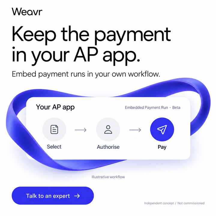
Weavr — Keep the payment in your AP app.
Behance ↗

Keep the payment in your AP app.

A concept for an AP product team whose users leave the app to complete a payment. The idea makes an embedded payment workflow visible within one familiar space.

Show moreShow less

The thinking

The message focuses on Embedded Payment Run: selection, authorisation and payment form one sequence. Authorisation stays explicit, and the Beta label reflects the product stage recorded in the brief.

The creative decision

One white container holds all three steps, with indigo drawing attention to payment. This is an illustrative workflow, not an integration screenshot or a promise of availability for every programme.

df.
Accordance / 15
IDEA 15
Accordance — Research the tax question. Review the sources.
Behance ↗

Research the tax question. Review the sources.

A concept for a tax professional researching a complex question who needs to inspect the basis of an AI response. Reasoning and sources become the central message.

Show moreShow less

The thinking

A cross-border transaction supplies the example question, without providing tax advice. Separate Reasoning and Sources tabs keep professional review visible in the workflow.

The creative decision

A paper card, restrained colours and a serif headline suggest a research desk. The diagram explains an approach; it does not guarantee that an AI conclusion is correct.

df.
Lyzr / OpenController / 16
IDEA 16
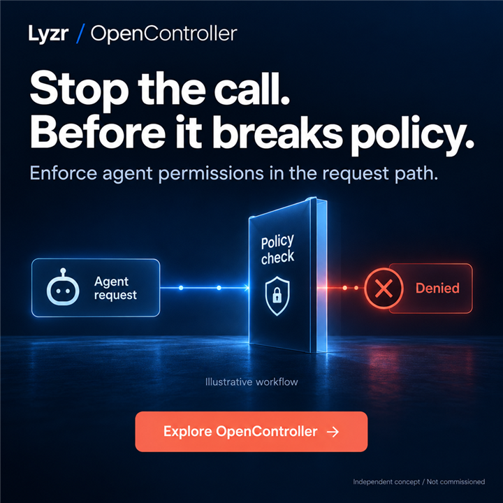
Lyzr / OpenController — Stop the call. Before it breaks policy.
Behance ↗

Stop the call. Before it breaks policy.

A concept for a team putting AI agents into production. It shows where permissions are checked: in the request path, before a disallowed action executes.

Show moreShow less

The thinking

OpenController is explained through one denial scenario. Agent request → Policy check → Denied ends at the refusal, with no successful action beyond it.

The creative decision

A navy field and illuminated path guide the eye towards the check; coral marks the stop. The workflow is illustrative, and actual enforcement depends on policy configuration and integration.

df.
Scrut / 17
IDEA 17
Scrut — Collect the evidence. Keep the review.
Behance ↗

Collect the evidence. Keep the review.

A concept for a GRC team gathering audit evidence from several tools. The message connects automated collection with a subsequent human review.

Show moreShow less

The thinking

Cloud, Access and Code converge on Evidence for review. That status matters: collecting material does not mean it has been approved or that an audit is complete.

The creative decision

A mint canvas, navy folder and fine connecting lines explain the process without a dense interface. The illustrative diagram avoids certification badges and completed-audit claims.

df.
bambooder / 18
IDEA 18
bambooder — Bamboo fiber. Built into composites.
Behance ↗

Bamboo fiber. Built into composites.

An industrial B2B concept for a materials engineer considering BambooSheet Pro for press-moulded components.

Show moreShow less

The thinking

The message names a material and invites a closer look at its specifications. Suitability of the composition and forming process still requires engineering assessment.

The creative decision

A layered sheet and a moulded panel make the subject tangible. Pale sage and a lime accent frame an illustrative material concept, not a product photograph or a certification.

df.
Zinc / 19
IDEA 19
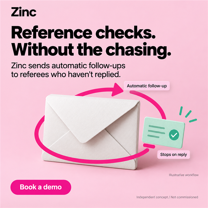
Zinc — Reference checks. Without the chasing.
Behance ↗

Reference checks. Without the chasing.

A concept for recruiting operations teams following up with referees who have yet to reply. One repetitive task becomes the focus.

Show moreShow less

The thinking

Zinc is explained through automatic follow-ups that stop after a reply. The message does not promise that a referee will respond or commit to a response time.

The creative decision

An oversized envelope, pink arrow and mint reply card make the mechanism visible. The diagram neither evaluates a candidate nor suggests unlimited reminders.

df.
Constant Contact / 20
IDEA 20
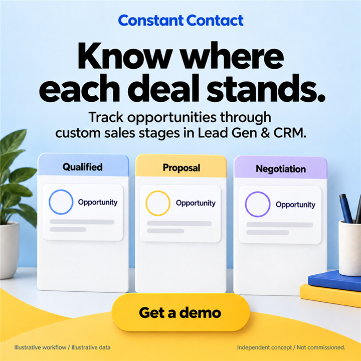
Constant Contact — Know where each deal stands.
Behance ↗

Know where each deal stands.

A concept for a sales manager preparing for a pipeline review. The task is to see where each opportunity sits in the team’s process.

Show moreShow less

The thinking

The focus is custom sales stages in Lead Gen & CRM. Qualified, Proposal and Negotiation are example stages, not a prescribed process for every team.

The creative decision

Three columns on a pale blue field organise the information, while yellow highlights the action. No automatic progression or won deals are shown: the concept explains visibility, not a sales outcome.

df.
Sahaj / 21
IDEA 21
Sahaj — Your engineering standards. Inside your AI workflow.
Behance ↗

Your engineering standards. Inside your AI workflow.

An engineering-service concept for a CTO whose team already uses AI tools. It asks how the team’s own standards can become part of everyday work.

Show moreShow less

The thinking

Three layers connect Team standards, AI-assisted work and Human review. Human review remains an explicit part of the approach.

The creative decision

Translucent sheets, plum typography and generous space create a calm engineering composition. This is a diagram of an approach, not a SaaS interface or a promise to eliminate every error.

df.
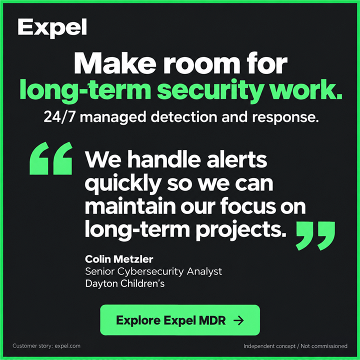
Expel / 22
IDEA 22
Expel — Make room for long-term security work.
Behance ↗

Make room for long-term security work.

A concept for a security leader balancing alerts with longer-term work. It draws on an Expel customer story preserved in the research materials.

Show moreShow less

The thinking

The artwork uses an excerpt attributed to Colin Metzler of Dayton Children’s, with his name and role. It describes an Expel customer’s experience, not the outcome of our advertising work or a guarantee for every team.

The creative decision

Large green quotation marks bring the text forward on charcoal. The layout avoids invented portraits, ratings and numerical promises. This independent concept was not commissioned by the brand.

df.
Basware / 23
IDEA 23
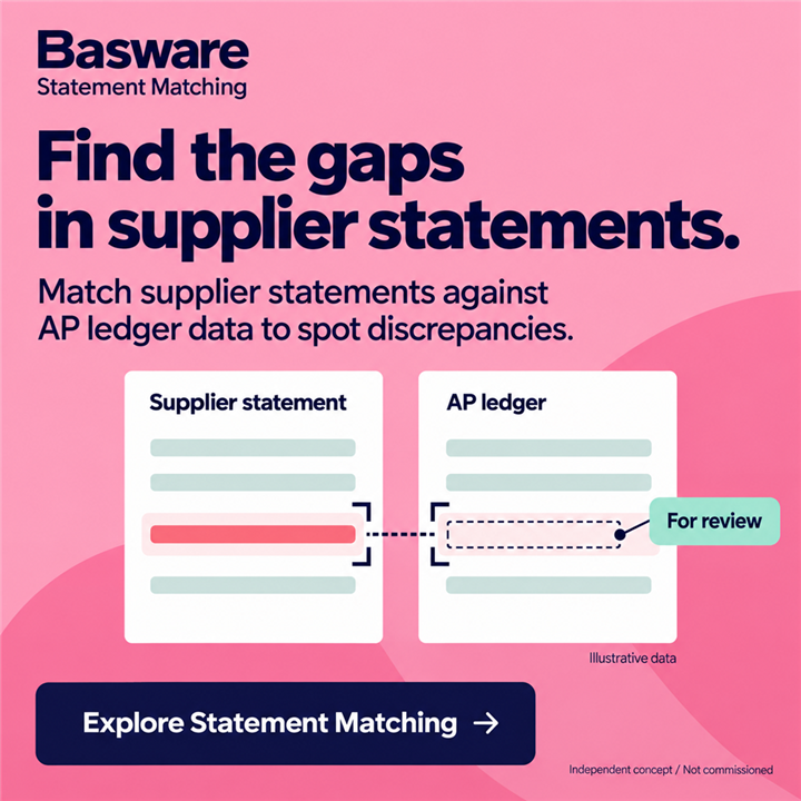
Basware — Find the gaps in supplier statements.
Behance ↗

Find the gaps in supplier statements.

A concept for an accounts payable team preparing for period close. It focuses on spotting differences between a supplier statement and ledger data.

Show moreShow less

The thinking

Statement Matching is explained by comparing two documents. A highlighted mismatch is marked for review, without promising recovered money or automatic payment.

The creative decision

A pink field holds white Supplier statement and AP ledger panels. A contrasting line and an empty slot opposite it reveal the gap. The data is illustrative, with no amounts or real invoices.

Full collection on Behance

02 / APPROACH

First, the why. Then, the way it looks.

Start with the product and the person who needs it. Find one clear message, then build the copy, composition and visual story around it.

01

Understand the product

Explore the audience, problem and product capabilities. Separate verified facts from assumptions.

02

Find the message

Choose one central idea. Find the words and visual approach that explain it together.

03

Build the creative

Work through hierarchy, brand character and detail. Check how the idea reads in the intended format.

MESSAGING / COPY / VISUAL DIRECTION

03 / START A CONVERSATION

Your product. The next idea.

Tell me what you’re building and the challenge you want to solve.

Independent concept · AI-assisted · Not commissioned

Project on Behance
DANA FINK / CREATIVE IDEAS

Pass the idea along.

An idea worth sharing. A conversation worth starting.